Pearl 6101
Fine dining's menu presentation at neighborhood prices: no dollar signs, no cents, ingredient-led names.
Pearl borrows fine dining's menu presentation, no dollar signs, no cents, terse ingredient-led names, and runs it in a moderately priced neighborhood Cal-Mediterranean room.
Menu-craft grade
Strips every money cue to bare whole-dollar prices, names dishes as confident ingredient lists, opens with a $4 oyster add-on, and tops out at a $35 scallop: fine dining's menu presentation in a moderately priced neighborhood Cal-Mediterranean room.
Graded on how well the menu uses behavioral economics, not the food.

- Type
- Independent
- Where
- San Francisco, Outer Richmond
- Cuisine
- California Mediterranean
- Footprint
- 1 location
- Since
- 2018
- Ownership
- Independent, employee-owned; from the Pizzetta 211 team
The setup
Pearl 6101 is the corner Cal-Mediterranean restaurant at 6101 California Street in the Outer Richmond, opened in 2018 by the team behind Pizzetta 211 and now employee-owned. The room reads casual and neighborhood, but the menu is doing something quietly precise.
It prints every price as a plain whole number with no dollar sign and no cents: “Oyster 4,” “Handkerchief 27,” “Seared Scallops 35.” That is the no-money-cue presentation of a fine-dining room like Gary Danko, here in a moderately priced spot (Michelin lists it “$$”) where the top plate is $35. The format is now common in better San Francisco rooms, but Pearl runs it cleanly and pairs it with terse, ingredient-led names. The restaurant's own line is “California inspired Mediterranean cooking with drinks to match,” food and bar as equals, and the menu lets the ingredients, not the prices, do the talking.
On the menu
Prices are bare whole numbers with no dollar sign and no cents: “Oyster 4,” “Bucatini 28,” “Seared Scallops 35.” The menu is sectioned Snacks, Starters, Pastas, Entrees, Dessert; dish names are title-case, ingredient-led, with minimal adjectives. A line at the top notes a 4.5% employee-health surcharge, removable on request. (Sampled from Pearl's live menu, 2026.)
fermented hot sauce, horseradish, lemon, dill
↳ the raw-bar anchor, priced to add on
toum, market pickles, sea salt lavash
white bolognese, grana padano, black pepper, herbs
↳ the most-cited signature pasta
albacore tuna, calabrian chili, preserved lemon, capers, bottarga
spaetzle, corn puree, grilled corn, braised red onions, espelette
↳ the high anchor: the top a la carte price
What they get right
The behavioral economics already at work.
Every money cue is stripped out
Plain “27,” no dollar sign, no cents, no decimals. This is the Cornell finding taken to its logical end: the more a price looks like money, the more it hurts to pay. The no-money-cue format is now common in better San Francisco rooms; Pearl runs it consistently across the whole page.
removing the money cue lifts spend ~8%, Cornell, Yang/Kimes 2009
No charm endings
Whole dollars, never “27.95.” Charm “.95/.99” endings read as a discount play; whole-dollar prices read as confident. It is a small, consistent signal that fits the room.
Schindler & Naipaul on round-vs-charm pricing
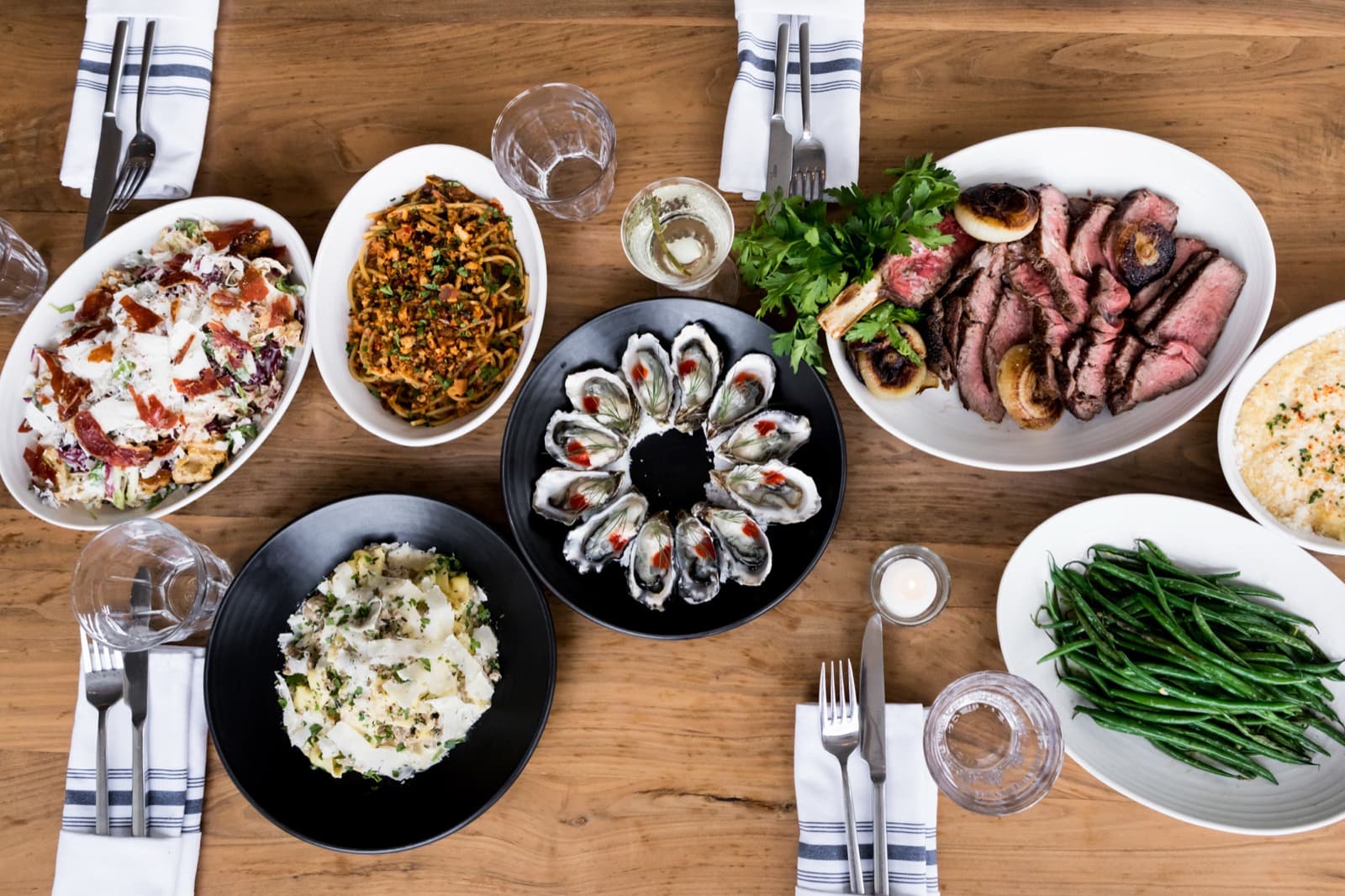
The oyster is an add-on engine
An oyster at “4” is a low-commitment yes that lifts the check and opens the raw bar. Small, round, repeatable, and it makes the rest of the order feel modest.
Ingredient lists do the selling
“white bolognese, grana padano, black pepper, herbs”: few adjectives, mostly components. The menu trusts specific, named ingredients to signal quality, the descriptive-label effect, and keeps the voice restrained so the food reads as confident rather than salesy.
Wansink on descriptive menu labels, 2001
What we’d test
The rewrite, with the expected lift and the honest caveat.
Make the signature the obvious default
The Handkerchief pasta is the dish everyone writes about. A quiet “most ordered” cue turns word-of-mouth into an on-menu nudge for the undecided.
Expect More orders of the hero dish
Caveat One cue only; this menu's power is its restraint.
Carry the voice onto the drinks list
The food copy is confident and ingredient-led. Giving the drinks list the same terse, ingredient-forward style would make the whole menu read as one piece, “with drinks to match,” as the restaurant puts it.
Expect Drinks read as part of the menu, not an afterthought
Caveat A menu-copy change; keep the house voice, terse not florid.
Let the surcharge line read like the menu
The 4.5% employee-health line sits up top in plainer type than the rest of the page. Setting it in the menu's own warm, confident voice keeps the one money-heavy sentence from breaking the spell the bare prices create.
Caveat A menu wording change, not a change to the policy.
What diners actually say
Synthesized from public reviews, the reality check that grounds every recommendation.
They praise
- Inventive cocktails and a strong bar
- The pastas, especially the Handkerchief
- Fresh oysters and seafood
- Cozy neighborhood-gem feel
They criticize
- Pasta can feel pricey
- Hard to get a reservation
- Small, busy room
The verdict
Pearl 6101 borrows fine dining's menu presentation in a neighborhood register: every currency cue stripped from the page, whole-dollar prices, ingredient-led names that let the cooking sell itself, a $4 oyster that opens the check, and a $35 scallop at the top. The format is now common, but Pearl runs it cleanly; the upside is small, carry that same confident voice onto the drinks list and let the surcharge line read as warmly as the rest of the menu.
Sources
Your menu next
Get this for your own menu, free.
Send your menu and we’ll send back the same breakdown, what you get right, what we’d test, and why.
Bix
A 1988 supper club hidden down a Gold Street alley, where live jazz, $18 martinis and tableside theater are the product and the food only has to clear the bar the room has raised.
Read it →